Understanding the Principles of Minimalist Design
What Makes Minimalist Design So Captivating?
Imagine walking into a perfectly tidy room—the kind that feels serene, yet purposeful. That’s the vibe minimalist design brings to your WordPress site. At its core, it’s not about stripping things away just for the sake of it. It’s about refining your layout so every single element serves a purpose. Less clutter means users don’t have to work hard to find what they need.
Think of it like curating a gallery. You wouldn’t cram every piece of art onto one wall, would you? Instead, you let each item breathe, giving visitors space to appreciate its beauty. Minimalist design applies the same logic to your website by emphasizing:
- Visual clarity: No competing elements fighting for attention.
- Functionality first: Every detail enhances usability.
- Elegance in simplicity: Understated, yet unforgettable.
How Simplicity Connects with Your Users
The magic of minimalism isn’t just aesthetic—it’s emotional. A clean design feels inviting, like opening an uncluttered drawer and instantly spotting what you need. Visitors trust websites that are easy to navigate and visually calming. Why? Because it shows you’ve put their experience first.
Take cues from pioneers like Apple, whose sleek and intentional designs exude confidence. Your site doesn’t need flashy animations or overwhelming colors to stand out. Sometimes, silence in design speaks louder than noise.
Choosing the Right WordPress Theme

Why Your WordPress Theme Sets the Tone
Think of your WordPress theme as the wardrobe for your website—it’s the first impression, the visual handshake. The right theme doesn’t just look pretty; it aligns with your minimalist soul while keeping everything functional and user-friendly. But here’s the problem: with thousands of themes to choose from, it can feel like hunting for a needle in a haystack of digital glitter.
The secret? Seek out themes that embrace clarity over clutter. A clean, minimalist theme will have plenty of white space, subtle typography, and simple layouts that don’t overwhelm visitors. Avoid themes bloated with unnecessary bells and whistles—animations and shiny sliders may look cool but can weigh down your site and distract from your content.
Features That Make Your Theme Shine
When picking a theme, focus on essentials that enhance both aesthetics and usability. Here’s what to look for:
- Lightweight design: Fast-loading themes improve not just user experience but also SEO rankings.
- Customizable options: Adjust fonts, colors, and layouts without needing to wrestle with code.
- Responsiveness: Ensure your site looks stunning on any device—smartphones, tablets, desktops.
Picture this: A visitor lands on your blog to read your thoughts, not puzzle over where the menu is or wait too long for pages to load. A clean theme creates breathing room, giving your words and visuals the stage they deserve. Opt for one that whispers elegance instead of shouting chaos.
Optimizing Layout and Navigation

Streamline Your Site’s Blueprint
Let’s face it: navigating a cluttered WordPress site is like wandering through a maze without a map. That’s why a thoughtful layout isn’t just a luxury—it’s the lifeline your visitors need. Picture this: you land on a website, and within seconds, you instinctively know where everything is. That’s the magic of *sharp navigation*.
Start by assessing your menu. Is it focused? Trim it down to the essentials—think **5-7 core options at most**. Overloading menus is like trying to read a novel on a sticky note. Instead, guide users like a friendly host at the entrance of a cozy cafe, pointing them exactly where they need to go.
For added flair:
- Use clear, unpretentious labels (no one wants to decode “Zen Pathways” to figure out it’s your blog).
- Include breadcrumb trails for multi-level pages—simple, yet genius!
Design for the Fingers and the Eyes
Smooth navigation isn’t just about what looks good; it’s about what *feels* good too. Ever tried tapping on tiny buttons on your phone? Frustrating, right? Ensure clickable areas are large enough—your visitors’ thumbs will thank you!
And don’t underestimate spacing. Crowded elements scream chaos. Give breathing room between links and avoid side-by-side clutter. A minimalist layout should feel as serene as a tidy workspace.
Using White Space Effectively
Why Empty Space Can Be Your Secret Weapon
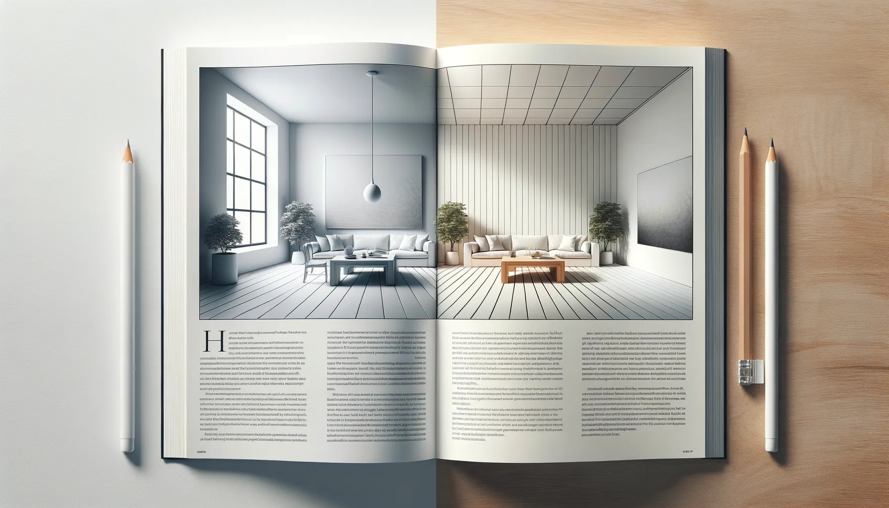
Let’s talk about the unsung hero of design: white space. It’s not just “empty space”—it’s breathing room, a place for your content to shine without screaming for attention. Think of it as the silence between musical notes; without it, your layout becomes noise, overwhelming and chaotic.
When used well, white space lets your visitors focus, guiding their eyes naturally through your page. Imagine landing on a site filled edge-to-edge with text and images—exhausting, right? Now picture a clean, minimalist layout where everything feels intentional—what a relief!
You can experiment with white space in small ways:
- Add generous padding around buttons to make them pop (and irresistible to click).
- Space out text blocks so your words feel approachable, not intimidating.
- Use margins to give your layout structure—it’s the difference between claustrophobic and polished.
White space isn’t wasted; it’s what gives your design its elegance. After all, a gallery doesn’t cram paintings together on one wall—it curates, making every piece special. Why shouldn’t your WordPress layout do the same?
Balance Over Blankness
The key here is balance. Too much white space, and your website risks looking stark—like an under-decorated room. Too little, and users will feel crammed into a cluttered closet. Aim for harmony.
For example, feature an engaging image with plenty of padding around it to create a sense of focus. Or keep your navigation bar simple with ample spacing between links for a modern, airy vibe. Look at brands like Apple or Moleskine—white space isn’t just a design choice for them; it’s a philosophy.
Enhancing User Experience with Minimalism
Why Simplicity Makes Visitors Stay
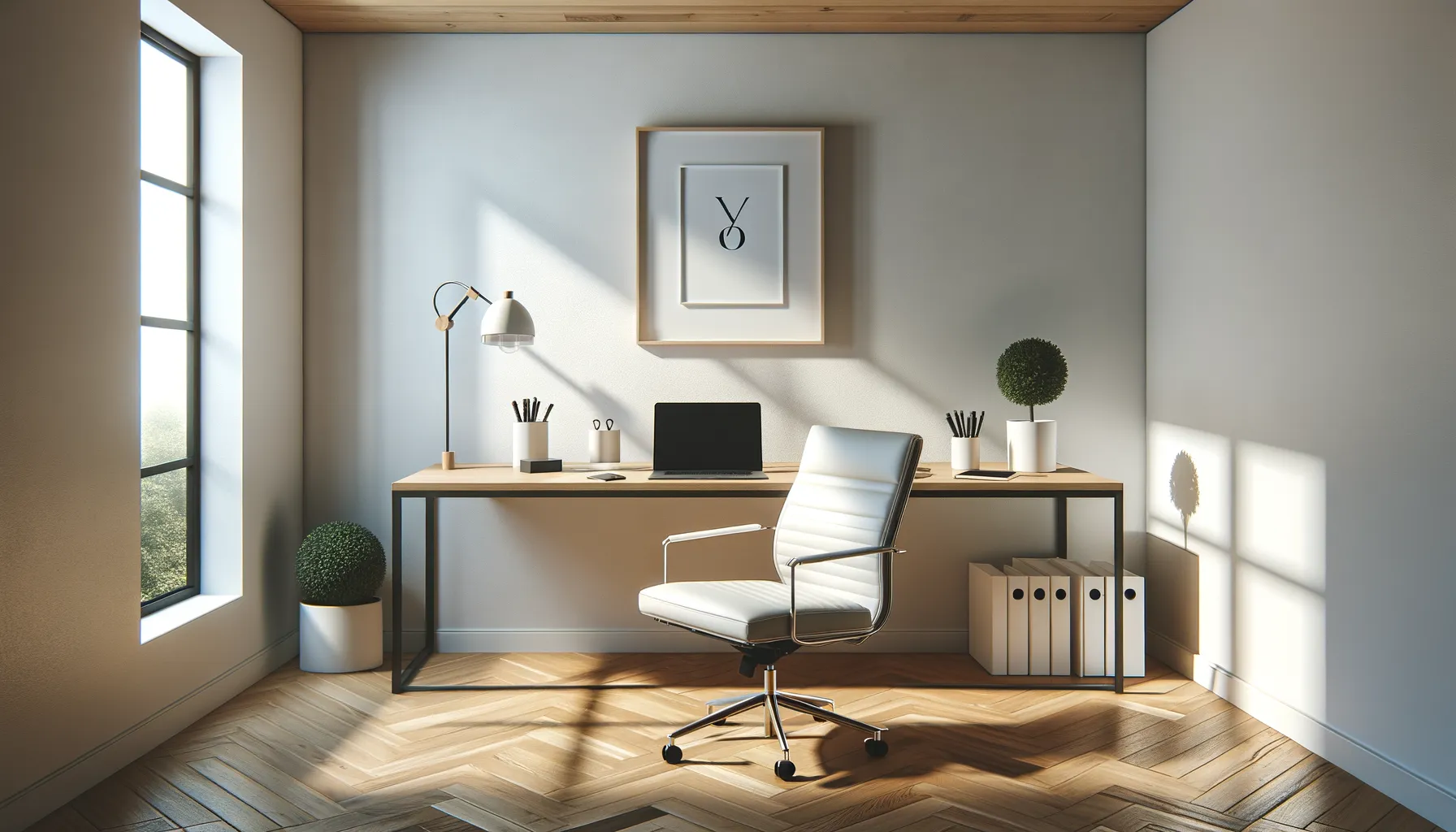
Ever landed on a website cluttered with endless menus, pop-ups, and distractions? It feels like walking into a messy room, right? Now imagine the opposite – a calm, open space where you instantly know where to go. That’s the magic of minimalism in web design. It’s not just about “less,” but about crafting an experience that feels intuitive and enjoyable.
A minimalist design invites users to glide through your site effortlessly. By offering fewer visual distractions, you’re gently guiding their attention to what really matters – your content, products, or call-to-action. Want more engagement? Focus on clarity and flow.
- Remove unnecessary elements: If it doesn’t serve a specific purpose, let it go.
- Prioritize readability: Use clean fonts, clear headings, and ample spacing between text.
- Streamline navigation: Fewer menu options mean quicker decisions for users.
When visitors feel at ease, they linger longer – like savoring a cup of coffee in a perfectly quiet café. With minimalism, your WordPress site isn’t just a digital space; it becomes a sanctuary.

