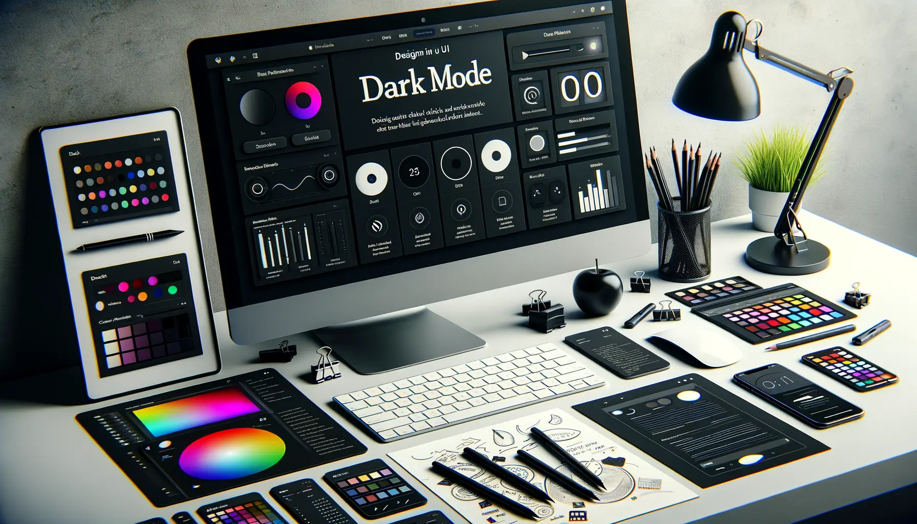
Understanding Dark Mode and Its Importance
What Makes Dark Mode so Special?
Have you ever felt your eyes screaming after staring at a glaring white screen in the middle of the night? That’s where dark mode steps in, like a comforting nightlight for your digital life. It’s more than just flipping your UI from white to black—it’s about how users *feel* while interacting with your app.
Dark mode taps into human psychology. Dim screens mimic our natural environment during evening hours, helping reduce eye fatigue and limit blue light exposure. Plus, let’s admit it: dark UIs just look cooler. They add a trendy, futuristic vibe that tech-savvy users can’t resist. Ask yourself—how often have you switched to a dark theme just because it “felt right”?
Key Benefits of Embracing Dark Mode
- Energy Efficiency: Especially on OLED screens, where dark pixels consume less power—a win for both battery life and eco-consciousness!
- Better Focus: A darker background highlights text and visuals, reducing distractions and putting content front and center.
- Accessibility: For users with light sensitivity or visual impairments, a low-luminance option can be a game-changer.
Choosing to implement dark mode is not just a design trend; it’s about respecting user preferences and ensuring everyone feels *seen*.
Best Practices for Designing with Dark Mode

Why Contrast is Your Best Friend
Designing for dark mode isn’t just flipping your background to black and calling it a day. It’s about creating something that feels effortless to the user, even when their surroundings are dimly lit. One key ingredient? Contrast. Without enough contrast, your text and icons could fade into obscurity like whispers in a thunderstorm.
Here’s a quick rule of thumb: pair dark shades with lighter fonts or elements. For instance, a soft gray background works wonders when combined with a crisp white (#FFFFFF) or light pastel text. But be careful not to go extreme—pure white on pure black can strain the eyes. Think balance, not drama.
Visual Comfort Meets Style
Dark mode is more than cool aesthetics—it’s about making the interface easy to use for hours on end. Stick to these best practices to get it right:
- Avoid pure black: Instead, opt for dark grays or very deep shades of blue/navy; it feels less harsh.
- Think color hierarchy: Use brighter accents sparingly to guide attention, but don’t overwhelm users with vibrant neon explosions.
- Test in real lighting: Check how it looks under different levels of brightness because not all “dark” rooms are created equal.
Remember, dark mode should feel like slipping into a perfectly tailored jacket—sleek, comfortable, and undeniably sharp. Nail that, and your users will thank you.
Technical Implementation of Dark Mode

Designing the Backbone: Code Frameworks and Key Techniques
Implementing dark mode isn’t just flipping a light switch—it’s like painting a masterpiece where every stroke (or line of code!) matters. First, you’ll need to decide on your implementation approach. Are you going all-in with CSS variables or relying on platform-specific APIs? The choice can shape the speed and flexibility of your deployment.
For most mobile platforms, using system-based toggles ensures your app dynamically adjusts to the user’s device settings. Here’s a quick breakdown of how to dive into development:
- For iOS: Use Apple’s
traitCollection.userInterfaceStyleto detect and apply dark mode styles dynamically. - On Android: Leverage the
AppCompatDelegateclass to seamlessly toggle themes at runtime.
Tips to Nail Those Smooth Transitions
Dark mode isn’t just about colors—it’s about experience. Sudden theme shifts can feel jarring, so transition animations are your secret sauce. Add fade effects or subtle dimming to make the UI adjustments smooth as butter. And remember: test color contrasts obsessively! Elements like buttons or text that looked sleek in light mode can vanish into the shadows without proper tweaks.
Your users will thank you for thoughtful details like these—they’re the tiny sparks that make dark mode shine.
Testing and Debugging Dark Mode Features

Spotting the Shadows in Dark Mode
Testing and debugging your dark mode features is like fine-tuning a symphony. Sure, the notes are written (your code), but you need to ensure every instrument sounds perfect together across devices, apps, and screens.
First, ask yourself: does the user experience feel just as smooth in dark mode as it does in light mode? Check for inconsistencies like text blending into backgrounds or buttons losing their visibility—these aren’t just minor hiccups; they’re design dealbreakers. A favorite trick? Use a mix of real-world data and extreme lighting conditions during testing. Think dim coffee shop lighting versus blazing sunlight by a window—how does your interface hold up?
- Color contrast: Use tools to verify sufficient contrast ratios. Your soft gray text might look lovely on black but can be unreadable for someone with visual impairments.
- Dynamic switching: Does the app seamlessly adapt when a user toggles between modes? Or does it stutter awkwardly like an unprepared public speaker?
And don’t forget your users’ devices. Test across various screen types because that AMOLED display on a flagship phone shows colors very differently than an older LCD screen.
Conclusion and Final Tips for a Successful Dark Mode Design

Why Small Details Make a Big Difference
Creating a successful dark mode design is like painting with shadows—you’re working with subtleties, and every little touch counts. Don’t underestimate how much it matters to get the contrast just right or how satisfying it feels when a button pops against a dark background, simply because you chose the perfect accent color.
Pro tip: Always think about how light interacts with dark. Shadows can add depth, but lack of contrast can flatten everything out. Test your colors on real-world screens, from the ultra-bright AMOLED to that worn-out budget device with questionable brightness. Trust us, not all blacks are created equal!
A common mistake? Forgetting about accessibility. Make sure text is legible for everyone, especially those with visual impairments. Keep in mind these essential final tweaks:
- Check text sizing—smaller fonts struggle in low contrast.
- Use motion carefully; animations can feel too abrupt in darker themes.
- Ensure icons remain recognizable with inverted palettes.
Put Yourself in the User’s Shoes
Imagine scrolling through an app at midnight, lights off, when suddenly, a blinding white ad pops up. Ouch! That’s what we’re avoiding here. Be consistent with your dark mode implementation, even if it means adapting ads, modals, or pop-ups. Seamlessness matters!
Above all, remember: dark mode isn’t just a trend—it’s how users want to engage with their screens today. Nail this design, and you’ve got their loyalty locked in.


