Importance of User-Friendly Navigation in Mobile App Design
Why Navigation Can Make or Break Your Mobile App
Ever opened an app and felt lost within seconds? That sinking “where do I even start?” moment isn’t just frustrating—it’s a deal-breaker. A user-friendly navigation is like having a clear map on a road trip: it removes stress, keeps users engaged, and makes them want to stick around for more.
Why does this matter so much? Imagine your app as a house. No matter how stunning the design, if people can’t find the door, they’ll walk away. Worse yet, if the rooms are a maze, they’ll leave confused, never to return. Confusion = uninstall.
A thoughtful navigation system meets users where they are—literally. On mobile, screens are smaller, attention spans shorter. It’s about giving them what they want, right when they need it.
Building intuitive paths through your app isn’t just important; it’s the difference between a quick exit and a loyal audience ready to explore everything you offer.
Key Principles for Designing Effective Navigation Menus

Put Simplicity First
Imagine stepping into a store where every aisle is labeled with cryptic symbols—frustrating, right? The same applies to your app’s navigation. A golden rule: keep it simple. Your users should never feel like they need a map to find their way. Stick to familiar patterns, like a hamburger menu or a bottom navigation bar, especially for mobile apps. For instance, stacking too many options in a single menu can overwhelm. Instead, think minimalism. Wouldn’t you rather choose from a well-organized bookshelf than a chaotic pile?
- Group related items logically—don’t scatter them across your menu.
- Make labels crystal clear, e.g., use “My Profile” instead of vague terms like “Account.”
Design for Touch, Not Just Looks
Remember, your menu isn’t just a digital painting—it’s interactive. Picture yourself trying to tap a tiny icon while holding a coffee cup—it’s not fun! Design buttons and menu items with touchscreens in mind. They should be big enough (44×44 pixels is a sweet spot!) and spaced apart to prevent accidental taps. Oh, and don’t forget thumb-friendly zones. Most users navigate with one hand, so place key menu actions within easy thumb reach. After all, convenience = happy users.
Types of Navigation Menus and When to Use Them
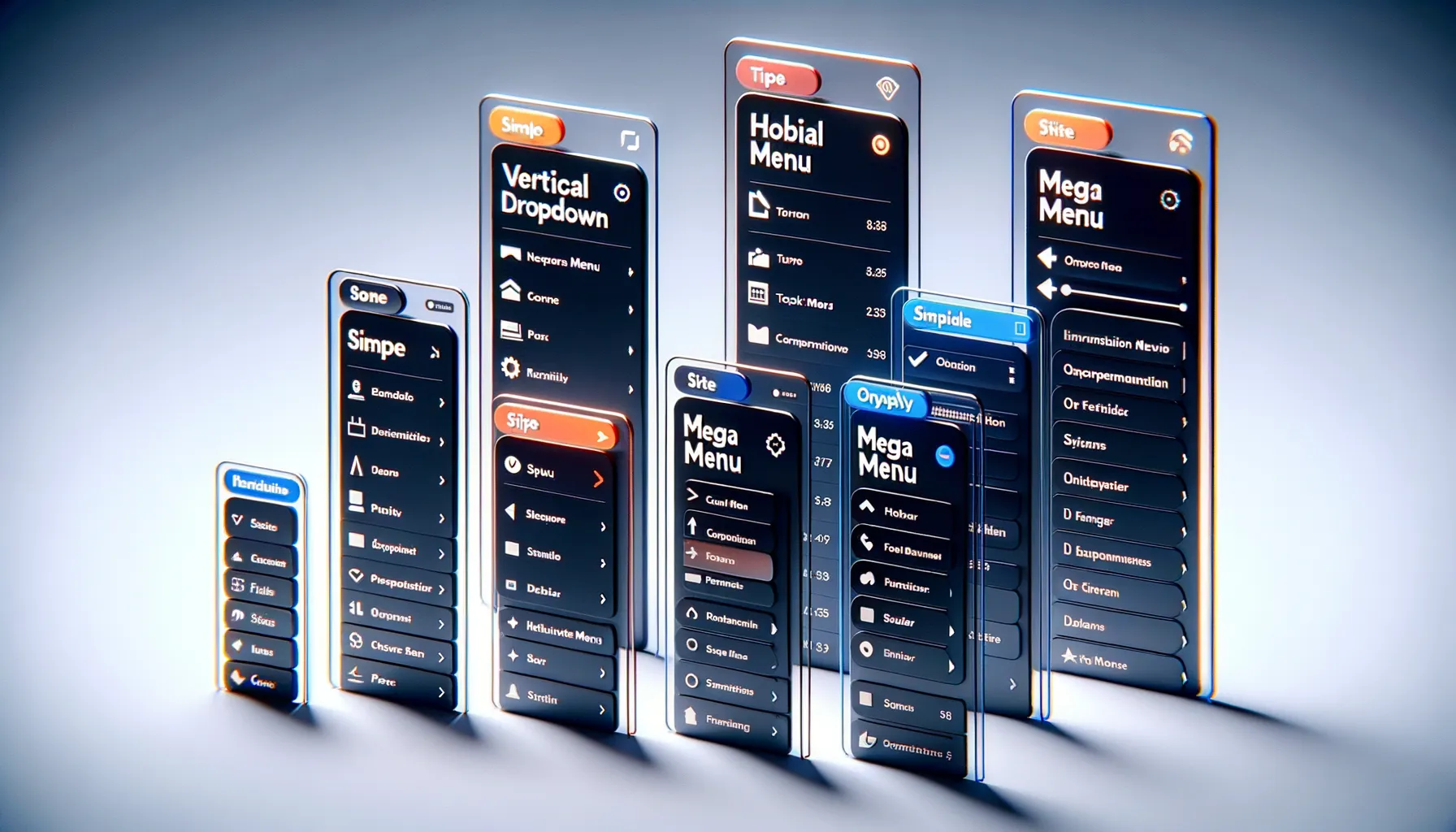
Navigation Menus That Fit Like a Glove
Picture this: your app is like a house, and the navigation menu is the keyring. The right key unlocks happiness; the wrong one? Frustration. Let’s break down the types of menus and when they shine brightest.
Hamburger Menus: Ah, the classic three-line icon. This is your go-to for minimalist apps. If your app has a dozen features or more (think productivity tools or e-commerce), the hamburger menu tucks them neatly away until needed. It whispers “clean and organized.”
Bottom Navigation Bars: When users need constant access to primary functions – say, in social media apps like Instagram – this bar delivers. It’s visible, intuitive, and perfect for top-tier features like “Home,” “Profile,” or “Search.”
- Tabs: Best for categorizing content or workflows. Imagine a recipe app where tabs guide you to “Appetizers,” “Main Course,” and “Desserts.” Right? Makes browsing deliciously easy.
- Side Drawers: Ideal for apps with secondary options. Think trip-planning apps that send you to settings, FAQs, or terms of service without crowding your screen.
The secret sauce? Knowing your users. A gamer navigating a complex RPG needs a different menu from, say, someone checking weather updates. Choose wisely!
Step-by-Step Guide to Building a User-Friendly Navigation Menu
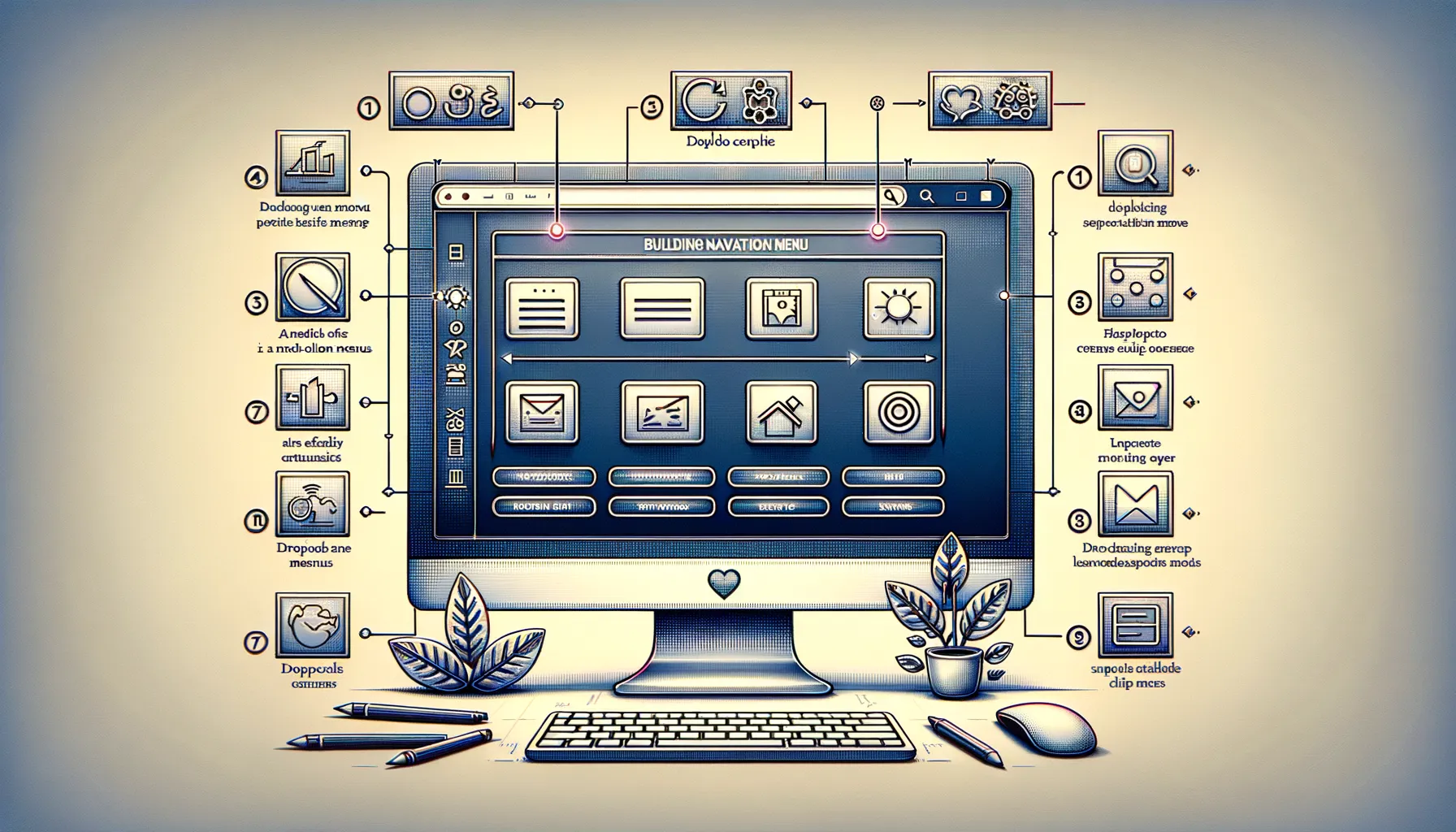
Visualize Your App’s Flow
Crafting a navigation menu isn’t just a design task—it’s like mapping out a treasure hunt where every tap leads to gold. Start by asking yourself: what do your users NEED to find, and how FAST can they get there? Begin with a visual brainstorm. Sketch out your app’s structure. Imagine your user journey from point A to B. Are they searching for a product? A profile page?
Once you have that mental map, categorize. Group related features logically—this is the foundation your navigation will rest on. For example, if you’re designing for an e-commerce app, consider bundling “Shop,” “Cart,” and “Wishlist” under one intuitive hub.
- Outline the main sections of your app—less is more here; keep it focused.
- Create a priority list; high-demand actions should take center stage.
- Wireframe your ideas. Yes, even a napkin sketch counts!
Test, Refine, Repeat
The secret sauce? Testing! Run your design past real users. Are they breezing through or fumbling for the right button? Gather feedback and tweak. Your audience is your compass, guiding you to perfection.
Best Practices and Common Mistakes to Avoid

What You Should Absolutely Be Doing
Crafting a navigation menu isn’t just a task—it’s an art form. Follow these best practices to turn your menu into a tour guide that effortlessly leads users wherever they need to go:
- Stick to Simplicity: A clean, minimalist approach wins every time. Users shouldn’t feel like they’ve walked into a maze. Keep categories clear and concise, with 5-7 options max.
- Prioritize the Primary: Place the most important features at the top or bottom of menus—users naturally look there first. Think of it as giving front-row seats to your app’s star attractions.
- Use Intuitive Icons: If you employ icons, choose ones that scream their purpose (think of a shopping cart for purchases). No one likes playing guessing games on an app!
Pitfalls That Could Derail Your Design
Even the sleekest apps can fall into traps that confuse and irritate users. Here’s what to avoid:
1. Overloading with Options: Offering too many choices might seem helpful, but in reality, it overwhelms. Decision fatigue is real—don’t make users run mental marathons.
2. Ignoring Thumb Zones: Imagine this: someone tries to reach a crucial menu item, and it’s tucked awkwardly in a corner. Ouch. Respect how users hold their phones and prioritize comfort over aesthetics.
3. Skipping Visual Hierarchy: Without clear labels, font size variations, or spacing cues, your menu could feel like a jumbled pile of words. Order matters—guide users’ eyes thoughtfully.
Avoid these blunders, and watch how your app’s menu becomes a seamless extension of your user’s mind!